Redd Mobile

United bank of africa

Redesigning UBA Mobile App for Personalize Consumer Experience.

As a the leading financial provider, UBA mission was to tailor the customer experience using disruptive innovation to deliver personalization, flexibility, and an enjoyable experience to users.

Business-to-customers
mobile
2021
3 months
App Preview
This case study does not reflect the view of the organization. All view are mine and complies with my non-disclosure agreement.

Today’s customers are using mobile devices to perform all their financial needs such as pay bills, manage finances, etc. like never before.

UBA REDD Mobile Banking app redesign was aimed at bringing more focus and attention to engagement and personalization of customers’ experience.

The Mobile app allows UBA to connect with customers and give them the experience and channels they need when they need it.

Role & Contribution

My roles in the project was to design a UX vision strategy and redesign the application based on research insights.

  • UX Researcher
  • UX Designer

process & methods

I contributed individually on this project, the following were my impact;

  • User Interviews
  • User Flow & Wireframing
  • Prototyping
  • Heuristic Evaluations
  • Usability Testing

team

I collaborated with large cross-functional teams within Nigeria and Rest of Africa to review the insights from the research, define a product vision and implement the designs on the final outcome.

the problem

Not limited to two, but my researched revealed valuable insights on issues around from the users’ motivations, frustrations and pain points that existed on the old application.

The results uncovered critical and strategic UX design decisions need to be taken to improve the solution.

insights

The following and more insights presented opportunities to solve problems;

  1. Confusing Onboarding - Onboarding is the first step to a successful Customer Acquisition. New and existing customers of the bank were confused with options were provided upon arriving on the application. Two third of onboarding attempts, resulted in drop-off in completing the goal.
  2. Complicated Information Architecture - An app must be intuitive for easy adoption. Feedback from users on first glance suggested the app is not intuitive and predictable. Customer required a lot of mental model to understand the solution and found it difficult to recognize simple real world steps in completing a goal.


the solution

The HCM Connect resolves many problems encountered over the years in the existing legacy solution. It aimed to remove the pain points of manual processing and documentation by delivering a novel design to the forefront built on React web app stack.

HCM Connect's goal automates 80% of processes improving the team to focus on people and be strategic in the workplace.

App Screenshot - Insights Dashboard
App Screenshot - Pop Designs
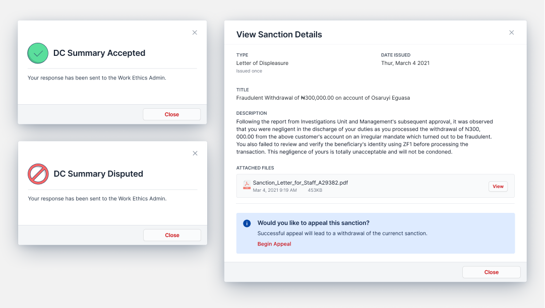
App Screenshot - Rewards & Sanctions Page